Branding White Birch Marketing was both exciting and challenging. Sarah had a strong vision, and it was up to me to bring it to life—while also ensuring it remained scalable and cohesive. Finding that balance between her expectations and a design that worked seamlessly across all platforms was a rewarding process.
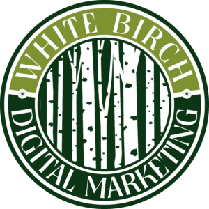
This logo was the original accepted piece. However, as the business grew and developed a more targeted clientele, Sarah was looking to make a change.
Her business is marketing to real estate agents and teams as well as to contractors and anything in the field. With this in mind we kept the birch tree motif and replaced the circle with the house and chose an new more modern serif font.
The Work in Progress
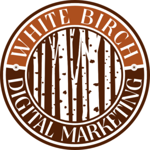
Below are some of the work-ups that were shared with the client during the process. We worked collaboratively in-person and through text messaging, and email.
The Final Design
The Basic Brand Guideline
This is the guideline that would come with the tier-one starter package, as you can see it include colors with hex numbers and the font used for the wordmark. Sarah received a few logo options, 3-5 revisions. When we agreed upon the final design A Google folder with basic files to overlay websites and print materials was sent.
One Response
Hi, this is a comment.
To get started with moderating, editing, and deleting comments, please visit the Comments screen in the dashboard.
Commenter avatars come from Gravatar.


Hi, this is a comment.
To get started with moderating, editing, and deleting comments, please visit the Comments screen in the dashboard.
Commenter avatars come from Gravatar.